Due to the large number of devices available for Android, it can sometimes get challenging to build app on the platform that works compliantly throughout. Different screen sizes, diverse display options and varying measurements from ever rising number of devices has a large bearing on how you decide on keeping the app consistent and high-on-quality for all the options targeted.
Well, not for those who put up with Adaptive Android Design. If you are an Android app developer and still don’t know what Adaptive Android Design is, it is a big miss for you. It is not a new technique or any distant idea. The bitter truth is it is something that we have been seeing working around for a couple of years now yet failed to make the best use of it.
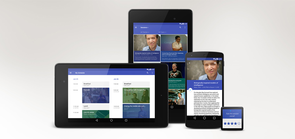
Let’s keep it simple, you have to have it if you want to raise your multi-screen performance to reputed levels. Till now, what you were doing was you had a device (say a smaller one with 4” display) and you used this size as a reference point for your app. When you needed to go to the next size, 7” or more, you should be thinking of stretching the same thing to fit into the frame. That’s not what you need to do with Adaptive Design.
So the underlying idea is not to make the phone user use tablet and tablet user use phone. Give them an experience out of the blue. Allow them an optimized, unique and consistent design for the device they are suing and not something that has been made to match those outlines and dimensions. Adaptive Android Design would not just help you squeezing everything to usage efficiency but also help you present your app better and sharper.
Adaptive Android Design is all about making the most of scaling and characterizing the requirements of different devices separately and appointing the right schema of layout and structuring to fit the design elements and objects in the most complementing manner – properly aligned with details of resource placement and functional enablement suiting the device requirements.
The mechanism that is employed and the factors that are made to work involve critical measurements of screen transition elements, static event, and the accommodation plans for them that are placed in the app design. This considers different functionalities supported, including user interaction and reception offered by different devices that are being targeted for Android app development.
Adaptive approach would help you significantly have a control over different display proponents by having a responsive device plan, taking over the complete resources that manage data display variations for different screens types. It would allow the tabs and texts to adjust as per the screen movement and make entities work in a consolidated way to support data at varying shift points – not letting the appearance to go weary and lose material presence, at the same time keeping the design layout and structure in the right shape.
Next time you build your Android app, go with Adaptive interface to keep it resource integrated, user-focused and plan-oriented and serve a wide array of Android users across an extensive variety of Android phones and tablets. Take it in a big and fat way and claim your piece of game on Android!


